- by 46 Tattoo
Black and Grey Tattoos with Color Accents
- by 46 Tattoo
Discover how strategic color accents can transform black and grey tattoos, creating focal points that draw the eye and add emotional weight to monochromatic designs.

Black and grey tattoos create depth through contrast, using nothing but ink dilution and shading to build dimension. But sometimes a design needs one deliberate pop of color to complete the story. A single red rose in a monochromatic sleeve. Blue eyes in a portrait. Gold accents in ornamental work. These touches transform good tattoos into memorable ones.
The technique works because restraint creates impact. When 95% of a design stays monochromatic, that 5% of color becomes the focal point. Your eye goes there first. The color carries emotional weight precisely because it stands alone.
Certain subjects lend themselves naturally to this approach. Floral designs are the most common choice, where a single bloom gets full color treatment while surrounding elements stay in grey wash. Roses work particularly well because their red creates maximum contrast against black and grey shading.
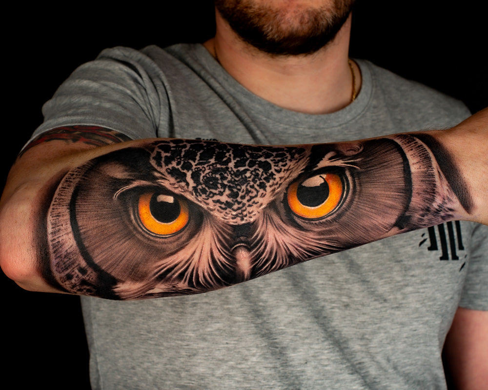
Portrait tattoos often use color accents for eyes, bringing life to an otherwise monochromatic face. Blue, green, or brown irises create a striking focal point that makes the portrait feel more alive. Animal portraits benefit from the same treatment, with eye color adding personality and depth.
Color accents work across all placements, but some locations showcase the technique better than others:
Size matters for color placement. Larger designs can support multiple accent points without looking cluttered. Smaller tattoos work best with one focused color element. A 4-inch piece with three different accent colors will read as confused rather than intentional.
Adding color to black and grey work follows a specific sequence. Your artist completes the monochromatic foundation first, building the full range of grey values from deep black shadows to soft highlights. Color gets added last, typically in the same session or a follow-up once the grey work heals.
The key decision is saturation level. Bold, fully saturated color creates maximum contrast and demands attention. Softer, more muted tones blend more naturally with the grey palette. Discuss your preference during the consultation so your artist can plan the composition accordingly.
Not every black and grey tattoo needs color. If your design already has strong composition and clear focal points, color might distract rather than enhance. The technique works best when color serves the narrative, like blood on a dagger, fire behind a phoenix, or the heart in an anatomical illustration.
Bring reference images of both pure black and grey work and designs with color touches to your consultation. Our artists can help you decide whether color accents will enhance your design or if pure black and grey creates the impact you want.