- by 46 Tattoo
What Makes a Tattoo Look Tasteful
- by 46 Tattoo
The difference between sophisticated body art and regrettable choices comes down to specific principles of design and execution.

Norman "Sailor Jerry" Collins tattooed sailors in Honolulu from the 1940s through 1973, blending Japanese aesthetics with American boldness. His flash designs still look stunning sixty years later. Meanwhile, countless tattoos from the past decade already feel dated. The difference isn't subject matter or size. It's the invisible architecture of good design, the technical precision of skilled execution, and choices made with longevity in mind.
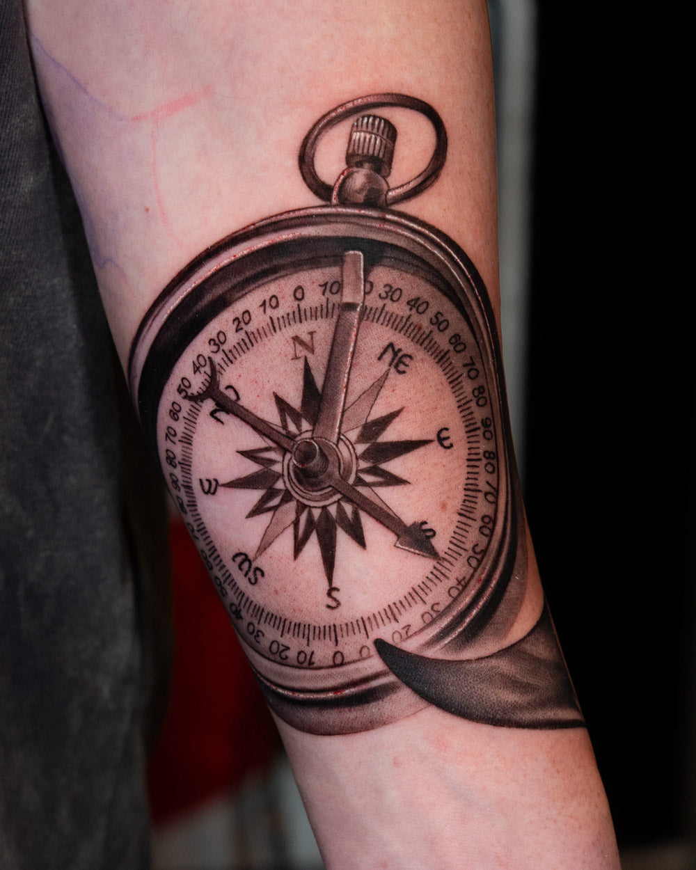
Tasteful doesn't mean conservative, small, or hidden. Some of the most sophisticated tattoos are full Japanese bodysuits and bold American Traditional sleeves. What unites them is intentionality: every element serves a purpose, nothing is random or rushed.
The first thing that separates refined work from amateur attempts is technical execution. When done well, technique is invisible. When lacking, it's painfully obvious.
Don Ed Hardy turned down a full scholarship to Yale's MFA program to apprentice under Sailor Jerry in Hawaii and Horihide in Japan. He understood that years of study under masters was worth more than academic credentials. Modern shortcuts produce modern regrets.
Traditional Japanese tattooing developed over centuries, evolving from woodblock printing techniques used by artists like Kuniyoshi in the 1800s. American Traditional emerged from decades of experimentation about what holds up on sailor skin through sun and salt. These weren't arbitrary aesthetic choices but lessons learned through thousands of healed tattoos.
The principles that emerged are consistent across cultures:
Perhaps the most undervalued element of tasteful work is what gets left out. A cohesive sleeve with three strong elements and thoughtful negative space reads as sophisticated. The same space crammed with seven competing focal points reads as chaotic, no matter how skilled the execution.
This editing happens at the design stage. Great artists push back when clients want to add just one more thing. They understand that each additional element dilutes the impact of everything else.
Trends in tattooing cycle predictably: tribal bands of the 90s, lower back flourishes of the 2000s, infinity symbols and watercolor effects of the 2010s, geometric minimalism more recently. Each felt permanent in its moment and dated shortly after.
Work that transcends trends draws from established traditions or personal meaning rather than current aesthetics. Sailor Jerry's designs still get tattooed today because they were built on principles, not fashion. The same will be true of quality work being done now.