- by 46 Tattoo
Script Sleeve Tattoos: A Complete Guide
- by 46 Tattoo
Words on skin are easy to get wrong and hard to fix. Here's what to know before you commit a sentence to your arm.

Script tattoos have been around as long as tattooing itself, but they were marginal for most of that history. The early electric machine era of the late 1800s favoured images: eagles, anchors, portraits. Words were an afterthought, usually a name or a short phrase tucked under a larger design.
That changed in the 1990s when tribal and gothic blackletter exploded in popularity. Lettering became a centerpiece rather than a footnote. By the 2000s, fine-line cursive script was everywhere, fuelled by the same wave of celebrity tattoo culture that brought tribal armbands and lower-back pieces into public consciousness. The backlash was predictable, but the style survived it. Today's script tattooing is precise, intentional, and genuinely difficult to execute well. The artists who specialize in it treat typography as seriously as any other visual discipline.
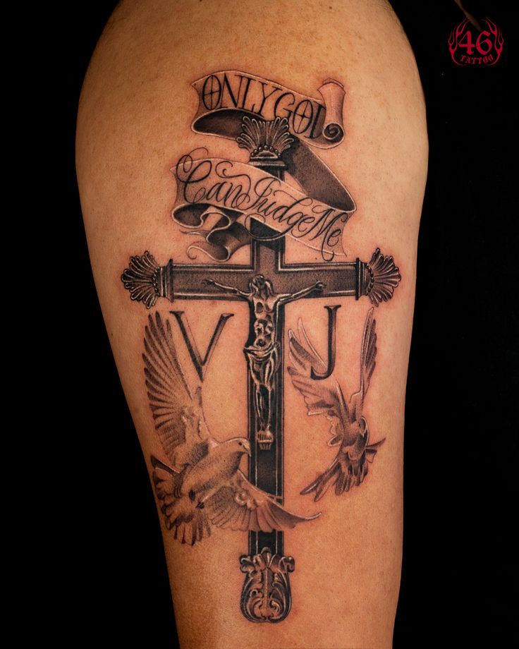
Typography becomes architecture at this size. The letterform carries a visual tone before you even read the words. Blackletter suits gothic or devotional themes. Cursive suggests intimacy. Block lettering reads as a statement. The choice matters and has to be made deliberately before design begins.
The arm's anatomy shapes how text reads. Letters along the forearm wrap naturally when the arm is extended. Vertical text on the upper arm reads differently at rest than raised. A good artist maps these dynamics before placing anything.
Most script sleeves combine lettering with visual elements. A portrait beside a name. Botanicals framing a quote. Geometric borders as section breaks. The imagery gives the words context, and the words anchor the imagery.
The key is scale. Script needs to read at the right size relative to what surrounds it. Too small and it disappears. Too large and it overwhelms everything else. Your artist will work through this balance during the planning phase.
Script ages differently than image-based tattoos. Fine, tightly-spaced lettering can blur as skin changes over time. Letterforms with clear character spacing and sufficient line weight hold their shape far longer.
Placement matters too:
Script sleeves vary more in session count than most other sleeve styles. A purely typographic sleeve with minimal imagery completes faster than a dense mixed piece. Sessions run 6 to 10 hours based on your comfort. Cost is by the hour.
What adds time:
For an estimate, reach out with the words, the tone, and any reference images. A short conversation is worth more than any number we could print here.